Orijeen is an innovative design studio based out of Seoul, Korea. Their portfolio includes furniture that is unique and modern. For designer Jeen Seo, the design process focusses on a relationship between humans, inanimate objects, and the surrounding environment. Each product is specially designed to stimulate the user into understanding the interactions between oneself and the surrounding furniture.
All the items in his collection are unique and visually stimulating. Each piece stands out and when placed in a room, it grabs your attention.
Color Flow Collection
The furniture range in this collection is perfect for people who like a lot of colour in their homes. If you cannot decide on a particular colour theme for your interior décor, this vibrant collection will solve all your problems. This furniture has a futuristic appearance that can fit in any house decorated in a modern design.
The collection is designed to “remind owners of the relationship between users and the object”. According to the designer, visual perception is the most effective and dramatic way of making people recognize the interaction between user and furniture.
The designer used lenticular technology so that the surface of the furniture has gradient hues. The colour shades change depending on where you are standing in the room, and how the light hits the surface of the furniture. To say in simple terms, these are colour-changing cabinets! For example, a small pill-shaped side shelf changes and shifts the hues between shades of fuchsia, sky blue and lilac. Another taller wardrobe shifts in hues of ocean blue, sunshine yellow, and lime green.
View this post on Instagram
Color flow collection #colorchange #lenticular #gradient #movement #furnituredesign

Color Words_Hangeul
This is another collection which uses the lenticular process. The range’s sharp and sleeker lines make it compatible with a modern-style décor.
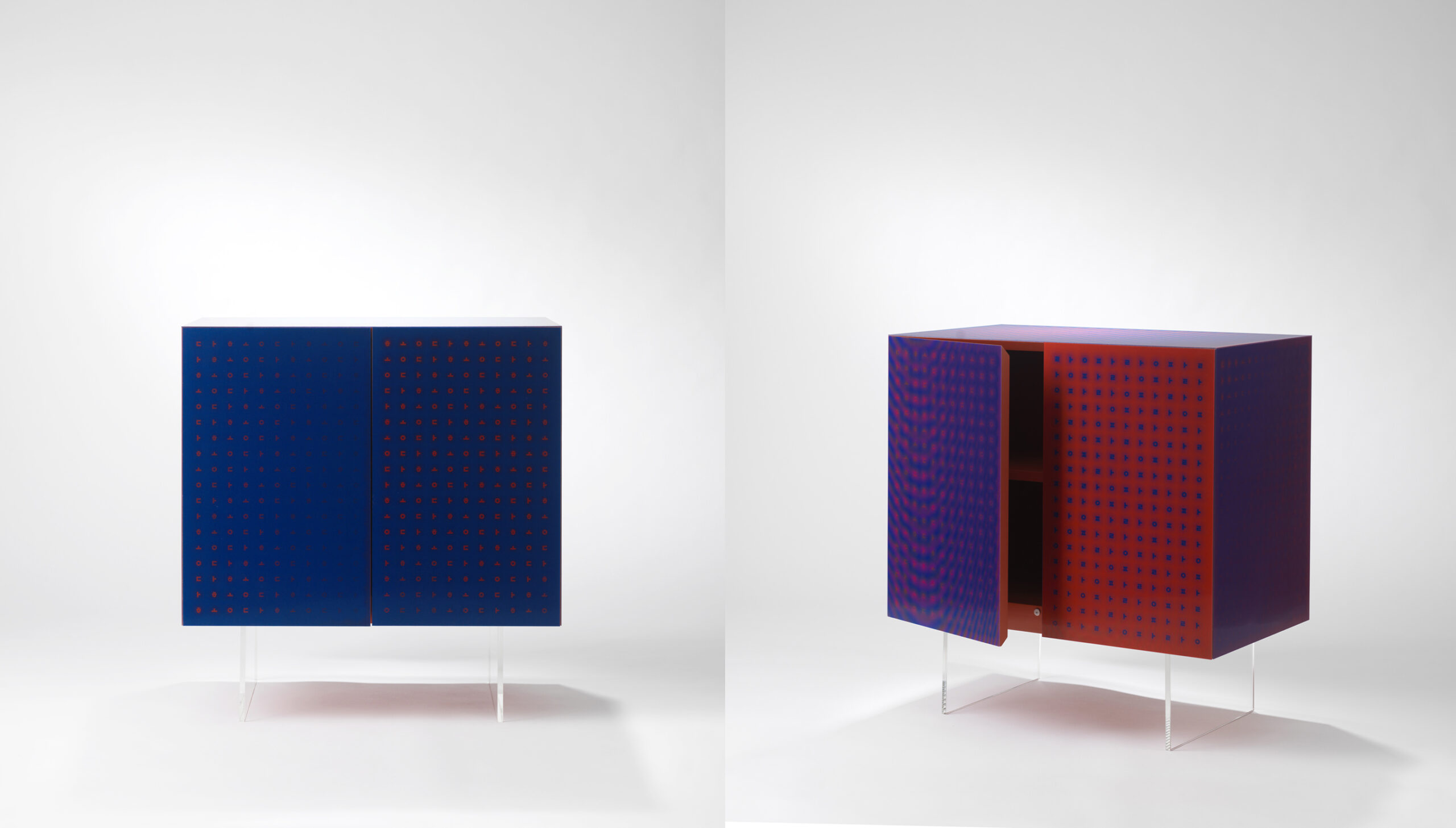
Hangeul and colour represent a variety of colour words in this collection. These words are one of the representative characteristics of Korean language representatives. Hangeul is the Korean alphabet which is written on the surface of the furniture. These characters transform because of the lenticular process. With this, the user can intuitively experience the relationship between Hangeul and colour.
When you move around, the hues on the surface change and you can see the characters of the Korean alphabet reveal themselves. The hues vary from ocean blue to white to fuchsia. In another smaller cabinet, the colour scheme shifts between red and navy blue.


Image credit: Orijeen







Comment here